
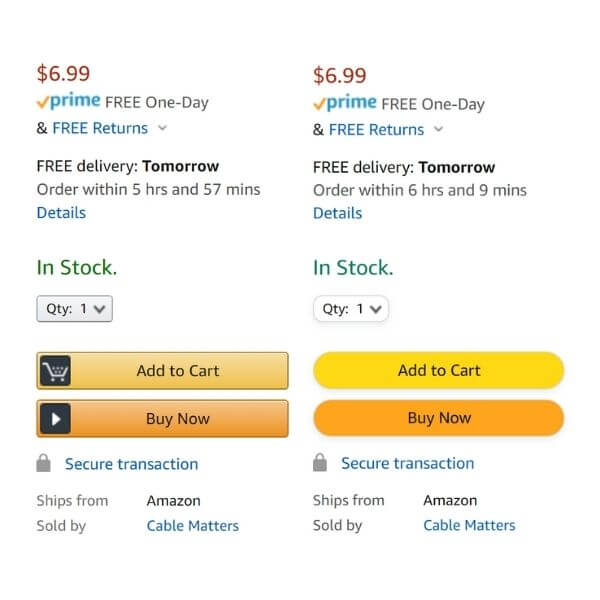
Amazon quietly made changes to their product and checkout page UX on Thursday morning, rounding the usually rectangular Quantity, Add to Cart, and Buy Now buttons — along with a few other adjustments.
The color of the Add to Cart and Buy Now buttons were also shifted to richer, higher-saturated tones of yellow and orange, respectively, and their associated icons were removed.
Overall, the changes give Amazon product pages a slightly cleaner, brighter look.
These redesigned elements appear to be part of live testing and aren’t showing up for everyone. For now, it’s unclear if the new look is available according to user, geographic location, or some other factor.
Amazon, the undisputed king of e-commerce, rarely makes UX changes, so this is big news, and their competitors should be paying attention.
What’s Different About The New UX?
- Rounded Add to Cart and Buy Now Buttons — Amazon has been using the same rectangular shape for years. There’s a lot of information I’ll get into down below about the UX advantages of rounded corners.
- New Colors — They’ve pumped up the contrast of the yellow Add to Cart button and the orange of Buy Now. If nothing else, these new buttons jump off the page.
- Icons Gone — The shopping cart and play button icons, usually inside the Add to Cart and Buy Now buttons, have been eliminated as part of the new look.
Friendly, Easy: The Advantages of Rounded Buttons
Shan Shen over at UXDesign said, “Fully rounded buttons are excellent in interfaces that have adequate space.”
The use of rounded buttons varies by industry, but the main selling points are that they:
- Stand out on the page
- Make the information inside the button easier to process
Playing cards, for example, are much easier to count and process when they have rounded corners, rather than hard edges.
The Bouba/Kiki Effect
At UX Planet, Taime Koe described how something called the Bouba/Kiki effect plays into button choice. Basically, the brain attaches meanings and traits to certain shapes. People tend to associate round shapes qualities like “easy going” and “friendly.”
Amazon will be looking to see if they can create these kinds of impressions — not just with the rounded buttons, but the color and icon changes too — and translate them into more purchases.
Is that a Tag? The Disadvantages of Rounded Buttons
There are actually some situations in which rounded buttons aren’t optimal.
- They can resemble tags
- They can fail at displaying nested options
- Fully rounded buttons don’t stack well
None of these are likely to create issues for Amazon in this situation, though.
Tag confusion tends to occur when the buttons are arranged horizontally across the top of the page. That’s not the case here.
In the case of the quantity button, Amazon has avoided the “nested options” problem by making the entire button clickable, rather than only the chevron icon.
Stacking isn’t a major issue here, either, since there are so few buttons.
The Science Supports Amazon’s New Button UX
Human eyes are conditioned for rounded corners. Round buttons create effective containers, and make for an even, natural user experience.
The other two aspects of the redesign — higher-contrast colors and fewer icons — seem to reflect an effort to simplify and declutter the product pages.
While Amazon hasn’t released any information on this test, we think you’ll probably see these changes become permanent at some point.
Historically, Amazon Has Valued UX Innovation
Back in 2000, Jeff Bezos said this about UX: “In our first year we didn’t spend a single dollar on advertising… the best dollars spent are those we use to improve the customer experience.”
So it’s clearly something the company is focused on, even if they don’t often overhaul their UX.
Newlee’s Take: Amazon Bets Against Reality
Amazon may be gearing up for a softer brand image. After all, the company has netted impressive gains over the course of the pandemic; others have fared poorly. While no one will stop buying from Amazon, everyone has the ability to complain about Amazon. Congress will hold more hearing. Tech companies will remain an easy target.
At least when those companies reside here, in the physical plane of existence.
Currently, Amazon’s buttons strongly recall the real, a UX choice that aligns with current thought and best practices. There’s something mechanically satisfying about pressing them. The embedded icons signal urgency, that time is of the essence.
Perhaps Amazon’s button changes are forerunners to a larger move: a move away from the messy, tangible world of supply chains and trucks and into the tame, abstract reality of information—just real enough to love, too light to hate. One could argue that excitement and power have been traded for geniality.
Or maybe Amazon has realized that the internet is our home now. A home, above all places, should be stress free.
We’re eager to see how the test plays out.